The Client
This project involved a comprehensive redesign of a major state’s Department of Education website. The goal was to transform a complex, content-heavy platform into a user-friendly and accessible resource for a diverse audience group. This initiative focused on improving information architecture, enhancing user experience, and streamlining content management for numerous internal teams within the Department.
The Problem
The existing website presented several significant challenges.
Complex Context Needs
The platform required the management and delivery of a vast array of resources, including policy documents, curriculum materials, certification forms, and news updates.
Decentralized Content Management
Multiple departments and content editors contributed to the site, and without a strong foundation of page patterns and components, led to wildly varying design from one section to the next and a confusing user experience.
Diverse Audience
The site served a wide range of users, including educators, administrators, parents, students, and community members, each with distinct needs and, importantly, levels of tech literacy.
The Solution
Structured, consistent Drupal content types
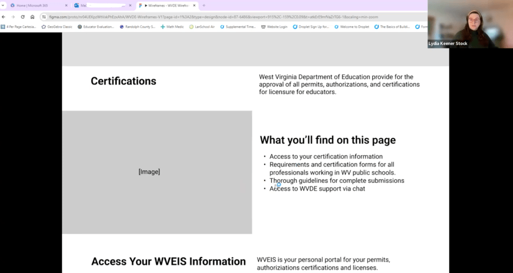
I introduced new structured content types, such as a dedicated “certification forms” content type, to improve content organization and accessibility.
Flexible component system
I designed a modular component system in Drupal 10 to accommodate the site’s diverse content needs, enabling content editors, who have varying degrees of savviness, to easily create dynamic and engaging pages that were consistent across sections.
Content strategy for priority audiences, by site section
I facilitated content strategy sessions where we co-built pages for key landing pages catered to different audiences to establish clear guidelines for content creation, maintenance, and governance.
See the website live here: The West Virginia Dept. of Education
How We Got There
To understand the organization’s needs and identify opportunities for improvement, we conducted a streamlined discovery process.
In-person stakeholder workshops
Facilitated workshops with key decision-makers to align on project goals and gather insights into organizational priorities.
Comprehensive user research
I created and launched a user survey that garnered over 1100 responses, providing valuable data on user behaviors and pain points.
Diverse usability testing
I conducted synchronous usability testing with real users to validate our designs and ensure the new certification forms content type was intuitive and efficient. This testing validated that our design solutions were effective. I also used card sorting exercises to test the usability of the sitemap and IA.
What I’m most proud of
To test the newly created “certification” content type, which would allow teachers to easily filter and search through dozens of different certification types, we conducted usability testing with real West Virginia teachers to pressure test our designs.
For a state facing teacher shortages, ensuring the path for new teachers to get certified was effortless was of great importance to the client.
We learned key insights to improve our designs, like changing terminology to better match the language used by administrators working with teachers and overall validated our design choices.